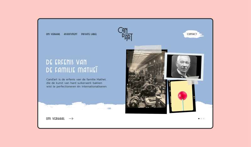
Cand'art
Non-believers say that making a B2B brand tasty is not worth the effort, but we couldn’t disagree more. We felt Cand’art deserved a fingerlicking contemporary branding, reflecting their DNA, but also their legacy.
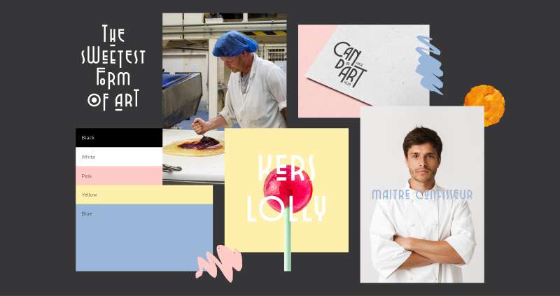
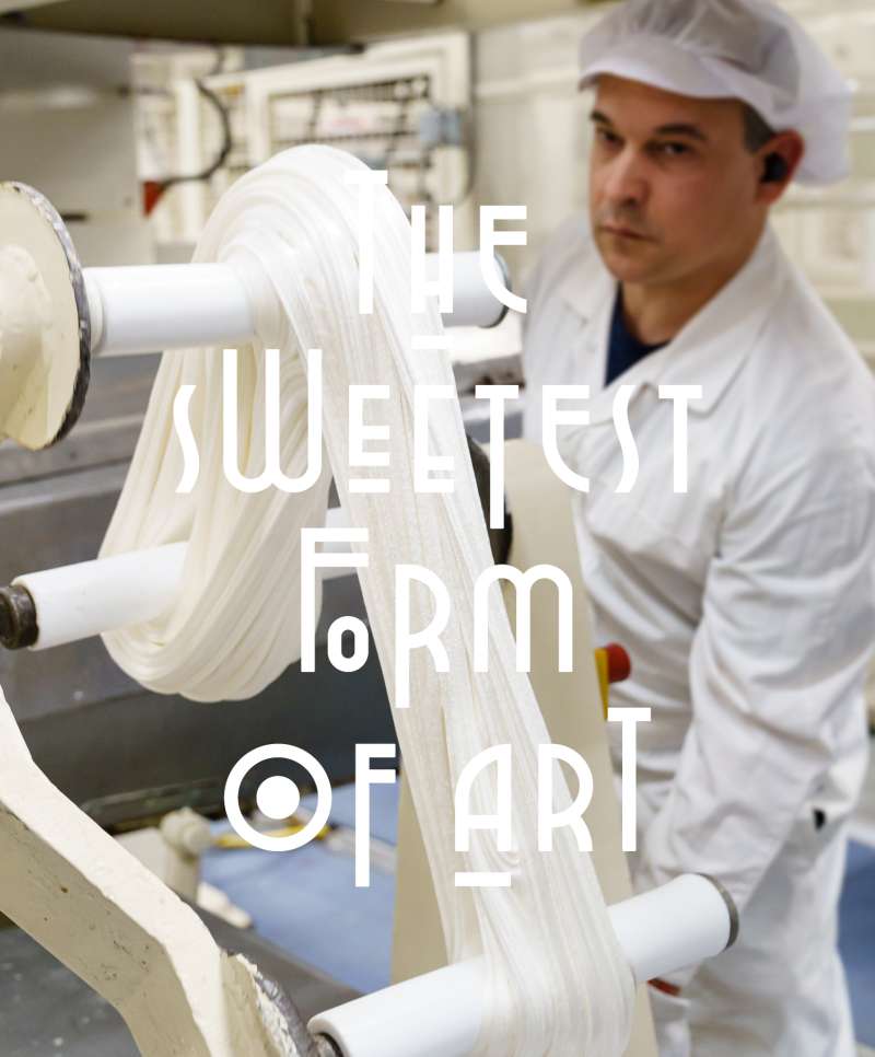
The sweetest form of art
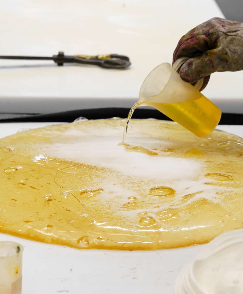
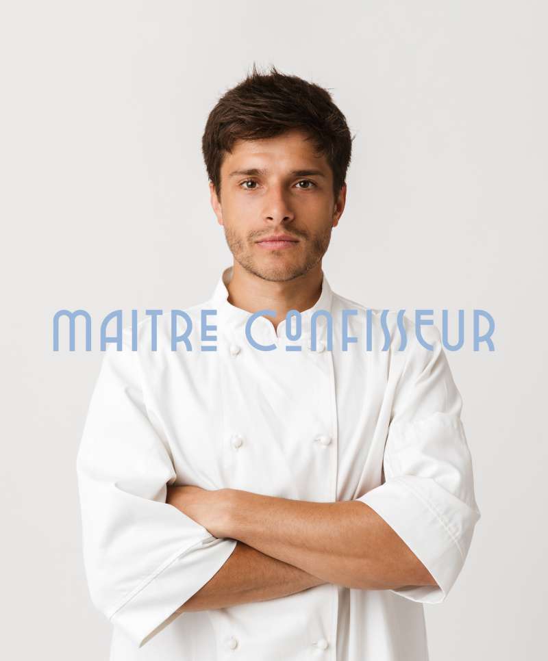
Cand’art is an established value for candy connoisseurs. Like a true artist, their in-house maître confisseur knows exactly how to add the right amount of flavorings and colors, bringing the absolute perfect lollipop to life. “The sweetest form of art”, Cand’art’s new tagline became an inspiration for the whole branding.
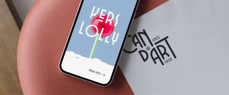
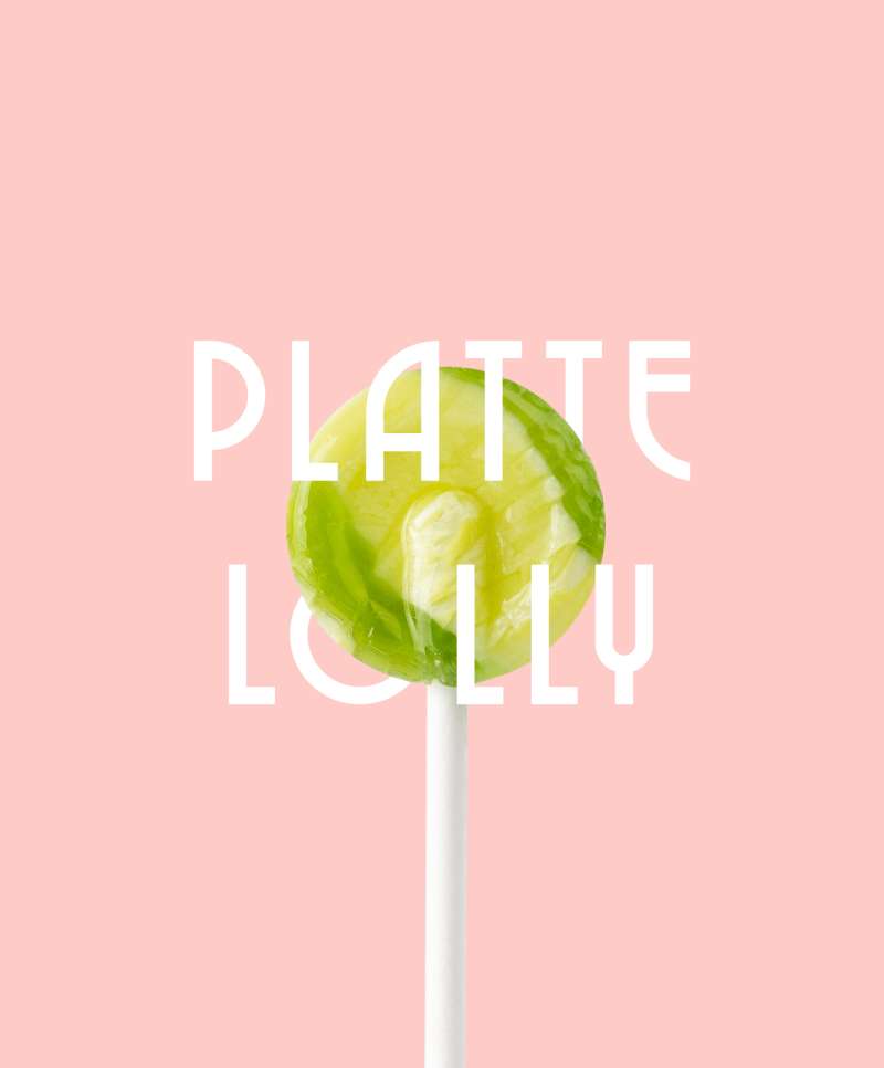
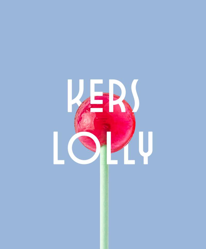
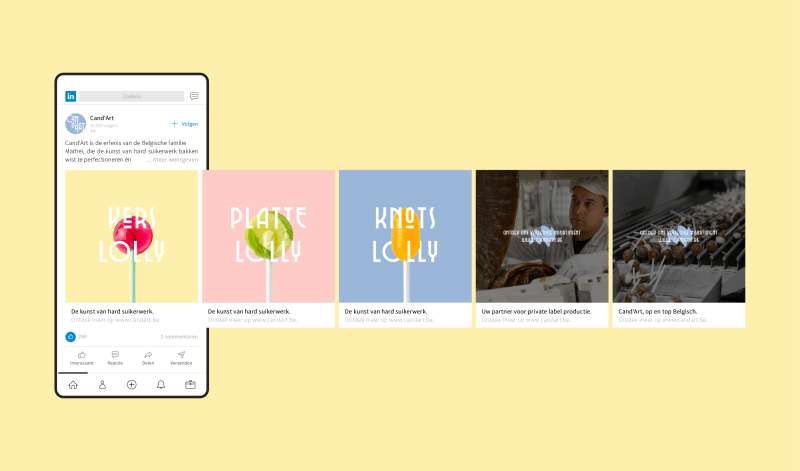
A fingerlicking typography system
Cand’arts rebranding features a dynamic typography system, that is flexible and playful, capturing the essence of the brand. The typography’s adaptability speaks to Cand’arts ability to shift fast, according to their clients’ needs. And it looks delicious too.

Herman Wellens, CEO of Candart
"Through strategy, rebranding, a new logo and a new website, Equals Three helped us make our beautiful products attractive to current generations. The result elicited rave reviews from our international customers."
Inspired by this case? Curious how we can make your growth count? We're happy to share our thoughts and discuss your challenges.
Get in touch
We’ll get back to you as soon as possible