Shinncare
A brand of skincare oils and products that wants to lift the taboo on intimate skincare? Count us in! Together with Shinncare, we created a unique brand that emits reliability, accessibility, and confidence.

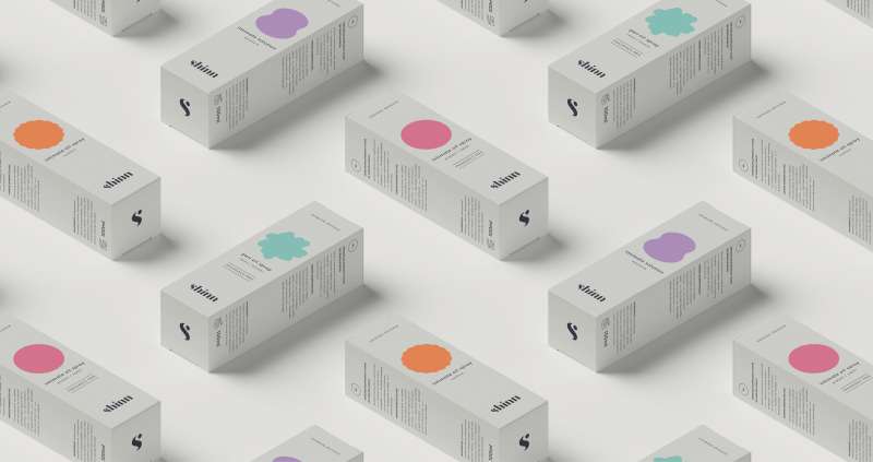
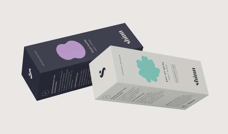
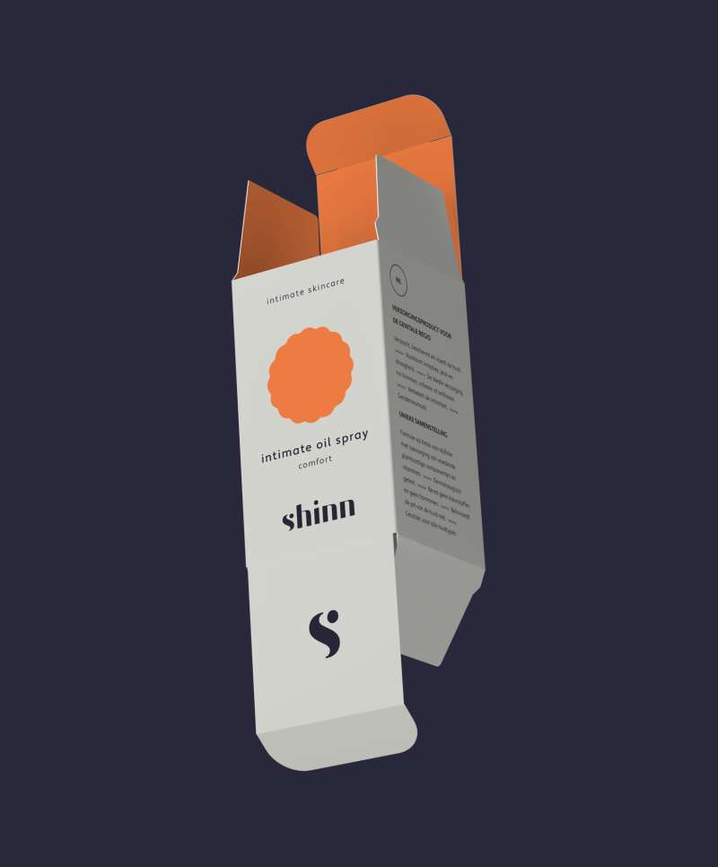
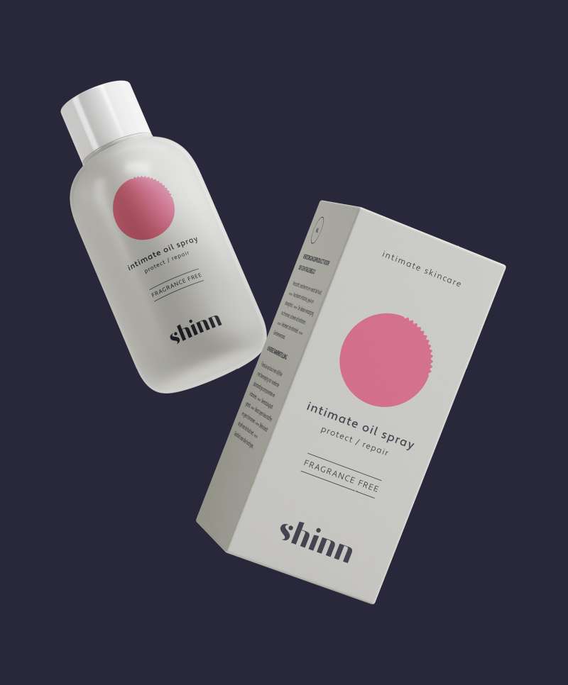
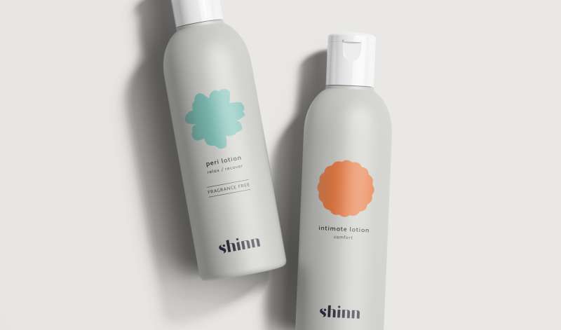
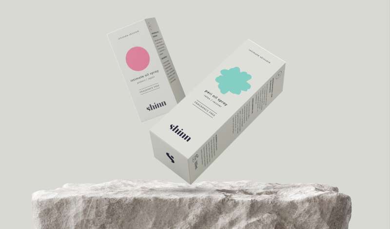
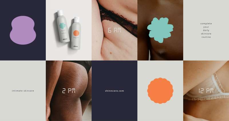
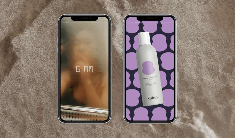
Minimal packaging design
While the light-gray base color emits reliability, the bright-colored, minimal illustrations make the packaging stand out in a classy way. The shapes aren’t perfect, accentuating that Shinncare’s products are for everyone.
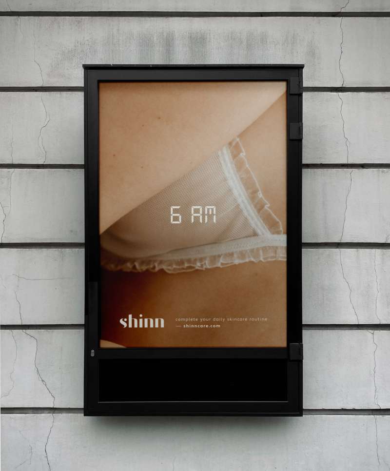
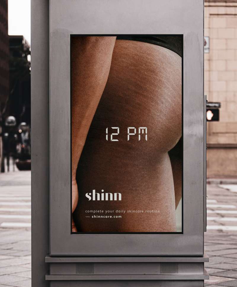
Intimate hygiene routine
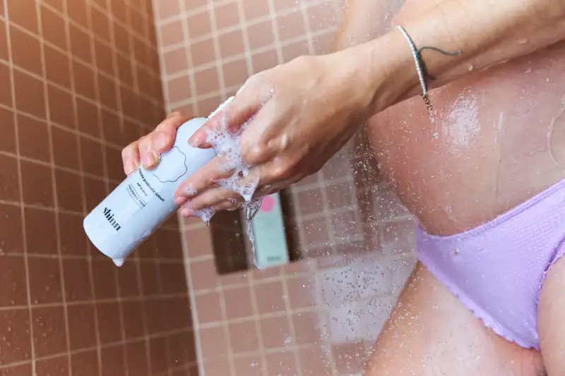
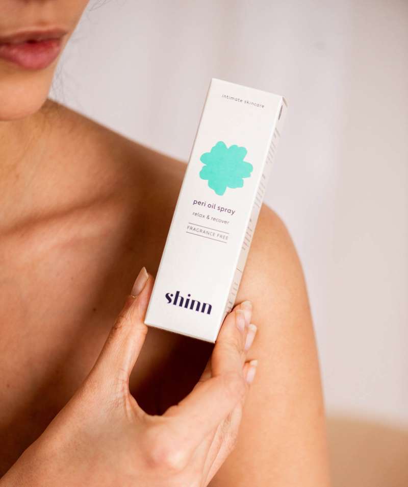
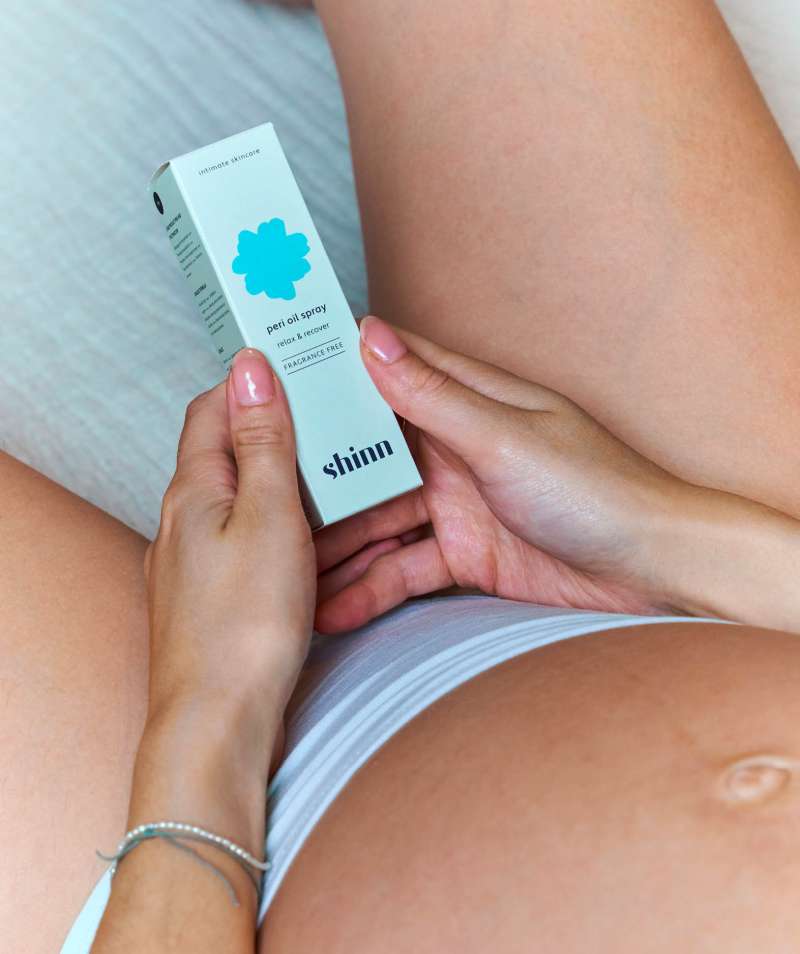
By using timestamps as a visual element in campaigns, Shinncare can communicate their goal of making intimate skin care part of our daily hygiene routine. The photographs – close-ups of imperfect, real intimate skin – reinforce the accessibility of Shinncare.
Inspired by this case? Curious how we can make your growth count? We're happy to share our thoughts and discuss your challenges.
Get in touch
We’ll get back to you as soon as possible